We collaborated with Apptopia to refresh their brand while preserving the integrity of their logo and core brand colors. Our approach involved modernizing their visual identity and enhancing the user experience on their website.
Categories
Brand Evolution, Client Acquisition, Content Creation, Creative Design, User Engagement
Brand Audit & Competitive Research
Building a Foundation for Growth
We conducted a comprehensive brand audit and competitive research to identify gaps in Apptopia’s current brand and how they could differentiate from their competitors. This foundation helped us create a targeted strategy that aligned their visual identity with their growth objectives.
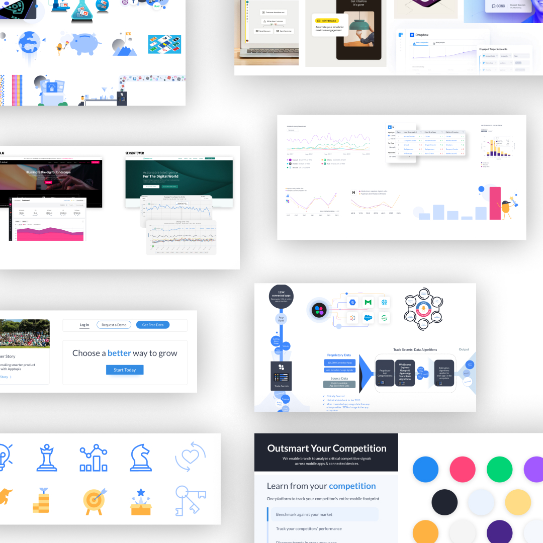
Social, Digital & Web Graphics
Amplifying Apptopia’s Digital Presence
We developed a suite of visually cohesive social media and web graphics that enhanced brand recognition across all platforms.
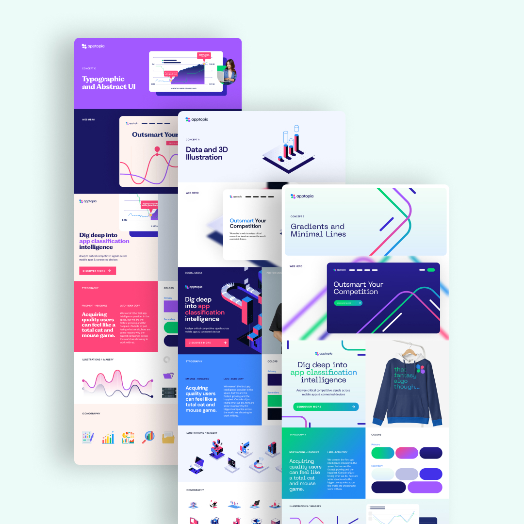
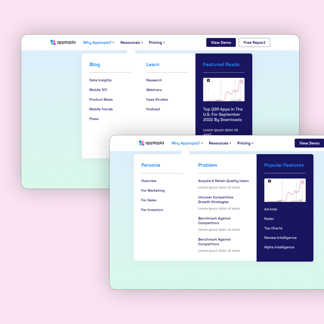
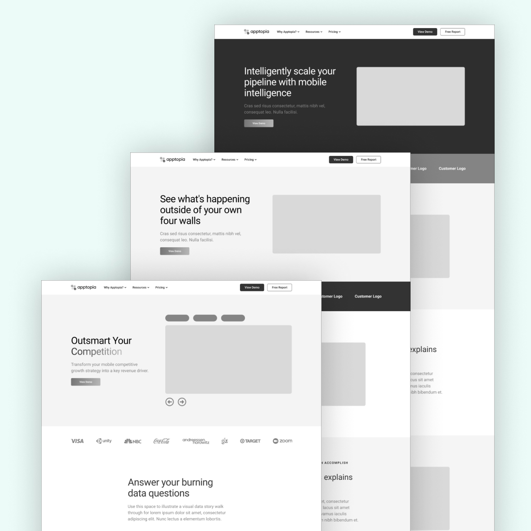
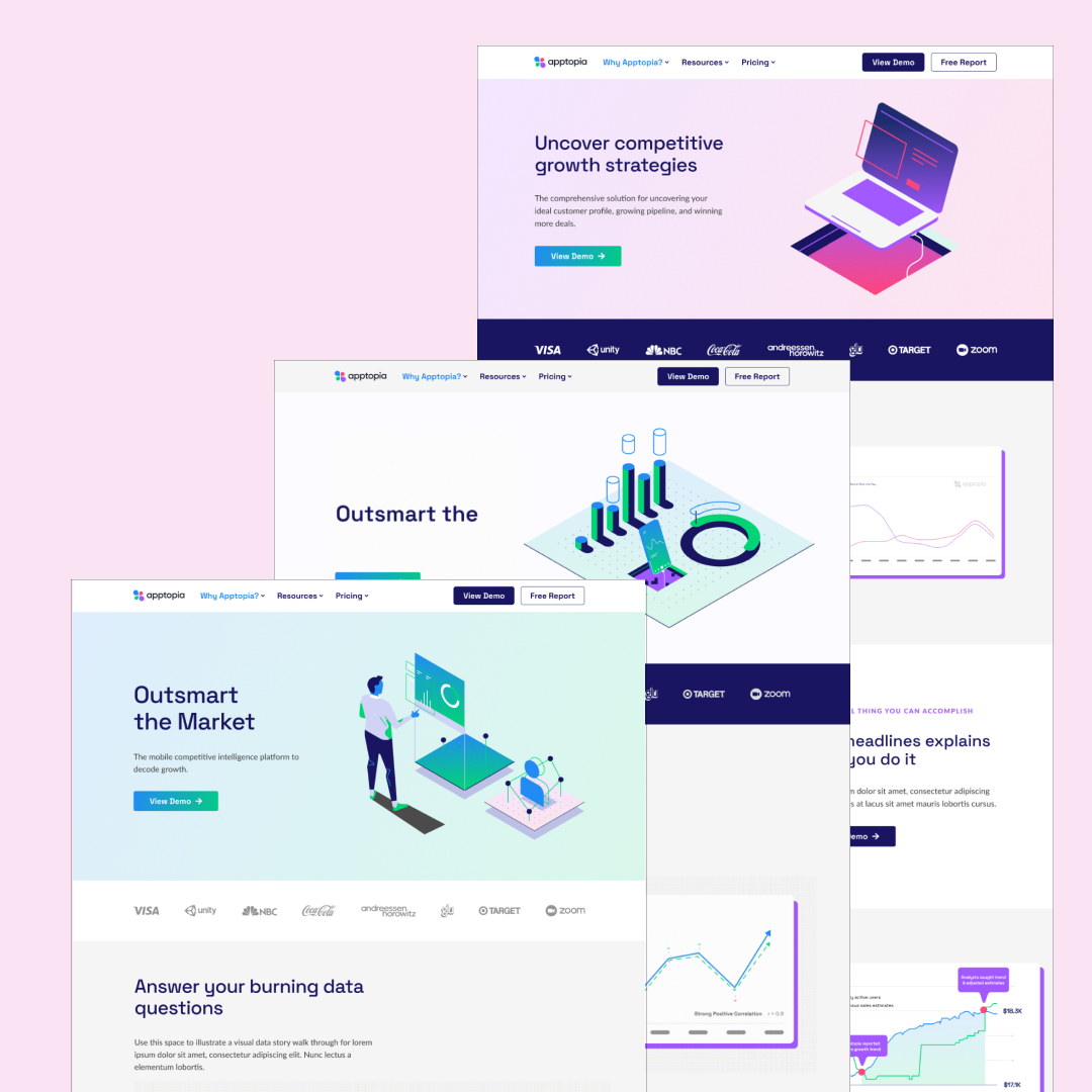
Three Design Concepts
Offering Creative Pathways
Our team presented Apptopia with three initial design concepts, each reflecting a unique approach to modernizing their brand identity. These concepts explored different visual directions to ensure the final design would resonate with both existing users and new enterprise clients.
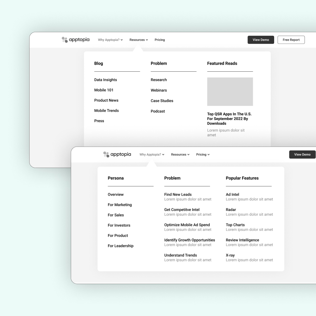
We created detailed navigation structures and wireframes, followed by high-fidelity prototypes to guide Apptopia’s development team. The modular design allowed easy implementation of the new landing pages while improving content visibility and user flow.
Bringing the Brand to Life
Semi-Custom Illustrations and Iconography
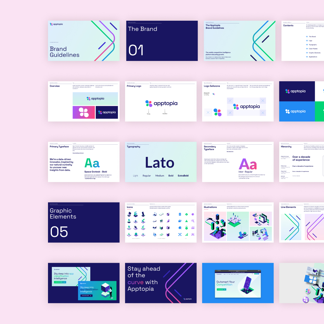
To enhance Apptopia’s visual identity, we developed semi-custom illustrations and icons that tied into their brand values of innovation and accessibility. These elements were used across their website, marketing materials, and presentations, creating a distinctive and engaging brand presence.
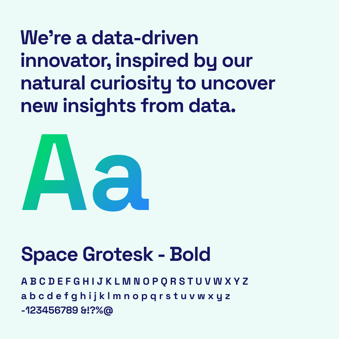
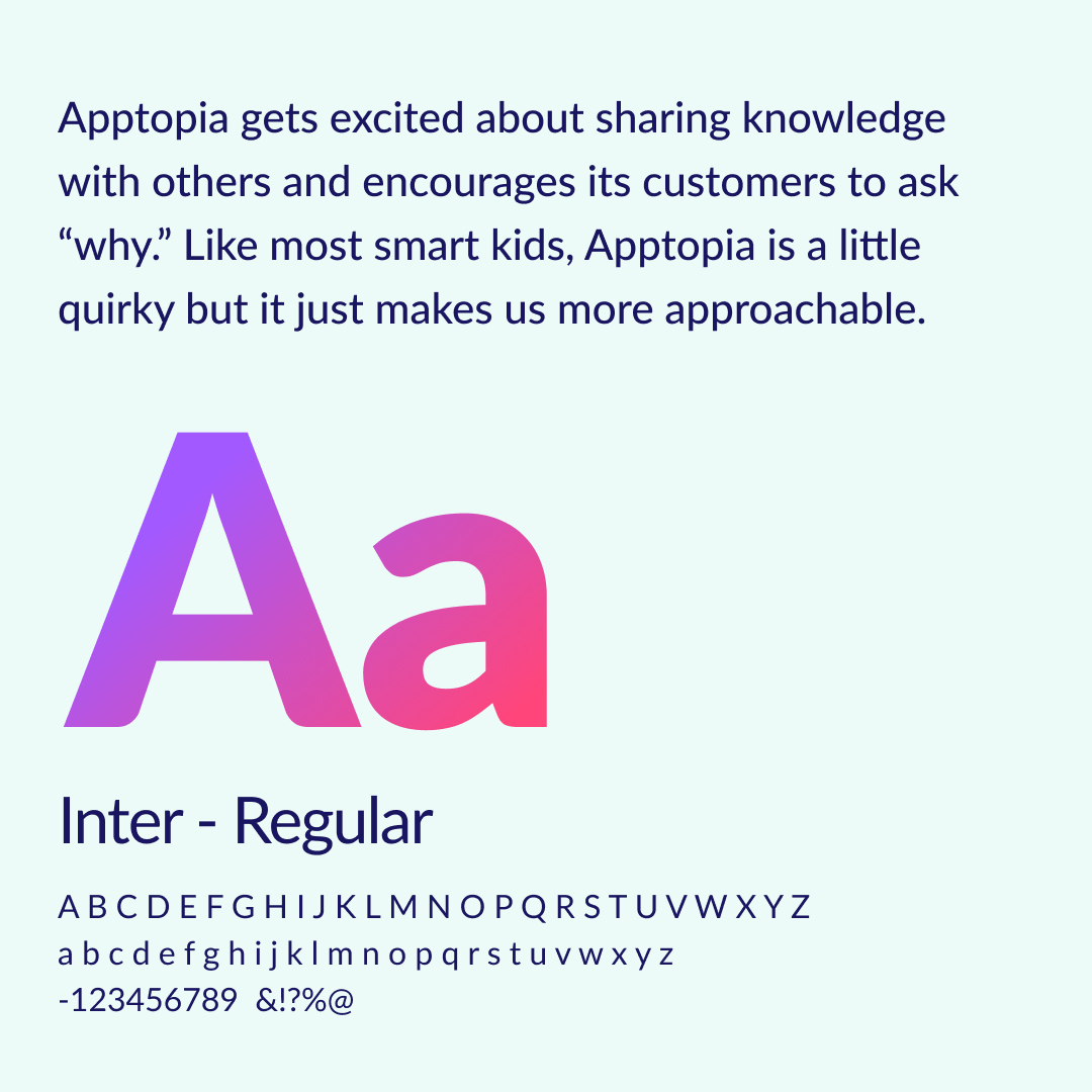
New Typeface
Merging Space Grotesk with Lato for a Modern Tech Feel
We introduced Space Grotesk, a sleek typeface that complements Apptopia’s existing Lato font. This pairing reflected Apptopia’s data-driven, tech-forward approach while maintaining clarity and professionalism in their visual communication.
Ensuring Consistency Across Platforms
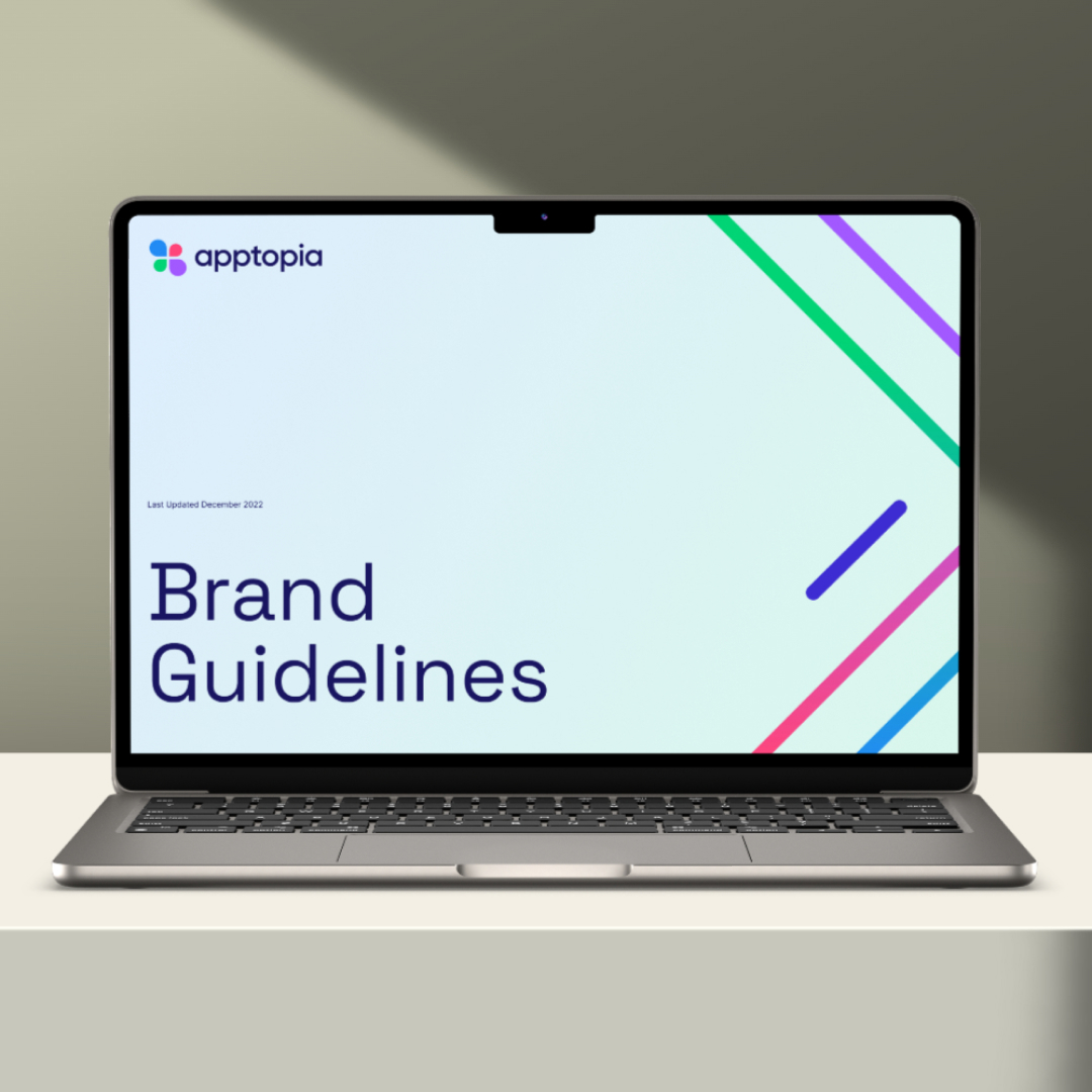
Refined Brand Guidelines
We expanded Apptopia’s standard brand guidelines into a robust document that included the new typography, illustrations, iconography, and modular page designs. This set of guidelines provided a clear roadmap for internal and external teams to maintain brand consistency across all touchpoints.
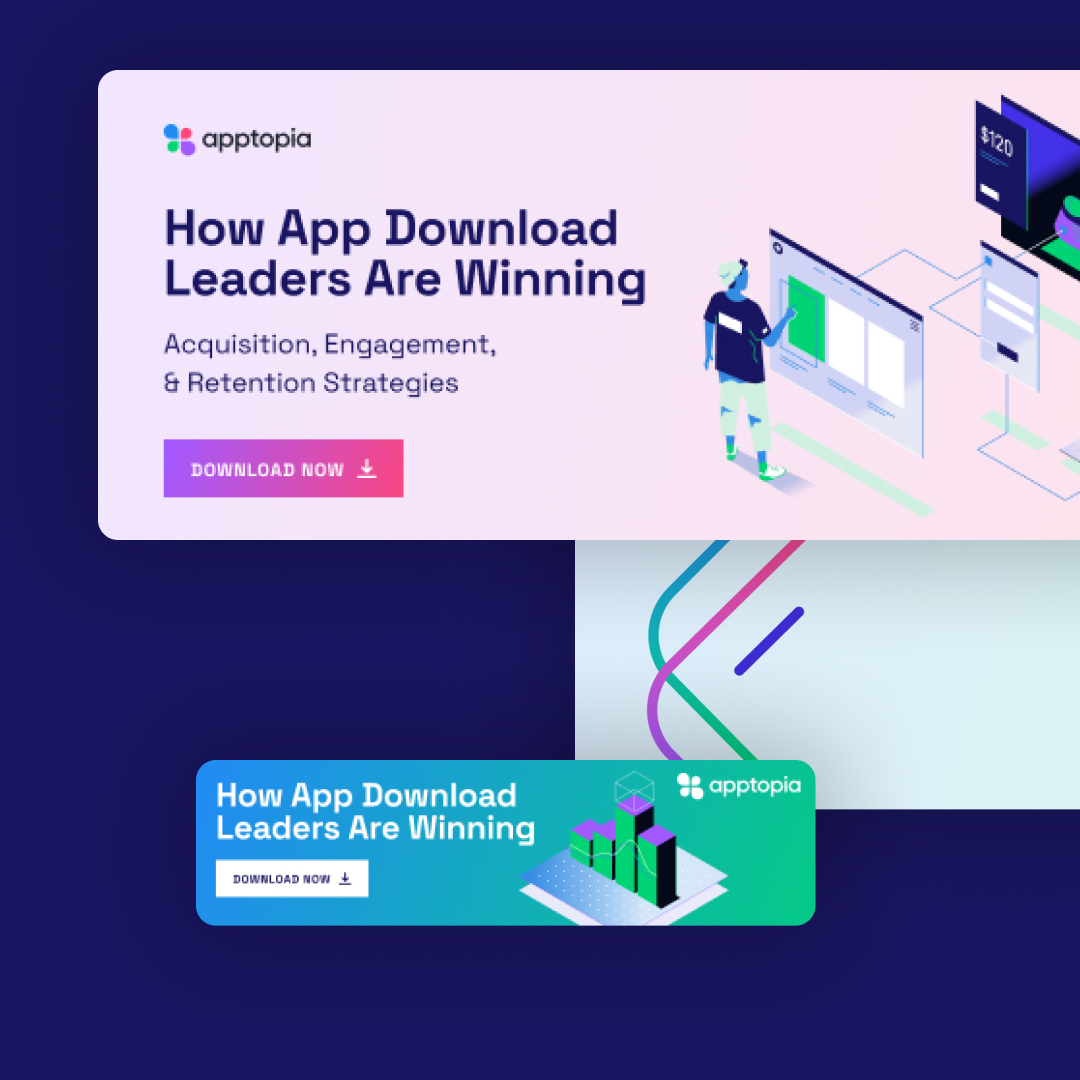
High-Value Ebook
Supporting Lead Generation Through Thought Leadership
As part of Apptopia’s upcoming lead generation campaign, we developed the ebook “How App Design Leaders Are Winning.” This content positioned Apptopia as thought leaders, providing value to potential clients while supporting their marketing efforts to attract new leads.
These updates not only elevated user experience but also established a cohesive, scalable brand presence across all platforms, driving long-term growth and recognition.
The Results
The refreshed brand and landing pages delivered clear benefits
While specific metrics remain confidential, by partnering with us, Apptopia achieved a refreshed, cohesive brand identity that better reflected its technological focus and market leadership. Apptopia is now well-positioned to grow and continue delivering cutting-edge app intelligence solutions to their expanding client base.
Improved User Experience
Easier navigation and more engaging content made it simple for users to explore Apptopia’s offerings.